Sunday, October 31, 2010

FOcontentRM: Objectified

Image from Tech Fresh
http://www.techfresh.net/
The film Objectified takes an interesting look at the culture of consumerism. By looking at Objects, their designers, and their audience, Objectified analyzes people. Designer Jonathan Ive says, "When you see an object you make many so assumptions about that object in seconds. What it does. How it will do it. How much it weighs." The same idea can be applied to looking at people. By looking at their choices in objects we make assumptions about them. Their age. Class. Style. Intelligence. Designer Chris Bangle says that cars are like our avatars. We choose our objects to please ourselves and make a statement. People are defining themselves with their mixture of selection.

Designers represent people. They create for an audience, but also for themselves and their personal aesthetic. Each designer represents the group of people that have a similar aesthetic or need. As Rob Walker says, companies want SKU's. They want more products to put on the shelf and sell. Because of this designers also have a responsibility to future generations. They have an ethical responsibility to create sustainably.

Image from treehugger.com
http://www.treehugger.com/
The film portrays piles of junked products, electronics, plastics, trash. To live in a consumer culture is to create trash. As a designer there are two choices if one wants to create ethically. As Karim Rashid says, Make it cardboard, make it 100% disposable. Design is about what is new and now and since it constantly changes it should be easy to dispose of. Why keep revisiting the archetypes? Designer Marc Newson looks at it a little differently. He says you should design something to last. Something is good design when it is classic eternal and doesn't go out of style. These two opposing views make pose an interesting question. What will the consumers do? The role of designers is to answer this question.

Objectified uses designers philosophies, shots of products, and people using products to ask the question... "What is the purpose of design?" "Where should design be headed?" Form and Content interact in this film by portraying images of new products being manufactured for masses of people and depicting the future resting place of the new products by showing older versions broken down and heading to a landfill. The film uses these juxtaposed processes to portray the content. What are objects? What is the responsibility of the designer? The consumer? What are you (the viewer) going to do with this information?
Watch this video on the evolution of cell phones. Scroll down.
http://cellphones.techfresh.net/evolution-of-mobile-phones/

Friday, October 15, 2010

Designing Fear

Image from Popcorn Monster
http://www.popcornmonster.com/2009/09/27/top-10-classic-horror-films/


Horror Movies exist in a highly criticized genre of entertainment. Opinion is widely ranging and fascinating because of the implications. A person's choice of horror films can be indicative of what that person fears, and how their imagination works. 
My favorite horror films are the ones that leave a lot to the imagination. A dark corridor and a growling noise is infinitely more scary to me than to watch than an array of special effects that realistically (or unrealistically) portray a demon, monster, or grotesque death.
Looking at the genre of the supernatural (See! Didn't I say preferences are indicative of a person's fears?) I will compare and contrast the techniques used to design an experience. I will look at the movies Paranormal Activity and Final Destination. 
Paranormal Activity is filmed as if it is a home movie. The effects are limited to footprints in baby powder, a door slamming, and loud noises among others that are equally simple. The build up of fear is created by the back story, the progression of small happenings, and the seemingly real style of movie. With so much left to the imagination, a mind that is creative can build on it's own fears.
Final Destination is a movie full of special effects. Crazy things happen again and again. The effects are realistic and convincing, and the pace of the movie is instant and consistent. There is no need to be creative or use your imagination because every detail is laid out. 
I loved Paranormal activity. It was a movie designed with an imaginative person in mind. Final Destination was not designed to scare ME, but I imagine there are others who would respond to these movies in the opposite way that I do. Fear is designed with it's audience in mind. "What's your favorite scary movie?" (Scary Movie, 2000). 


Trailor for Paranormal Activity


http://www.popcornmonster.com/2009/09/27/top-10-classic-horror-films/
A fun site!

Design as a Conversation

When we think about the meaning of the word conversation, we think of a back and forth exchange of information between people. Design is a means of conversation. It is a way to communicate information to people, but more importantly the people can communicate back by indicating their reaction to a design. The designer is then moved to change or add to their design to communicate more effectively.
When thinking of design as a conversation, and trying to find an easily noticeable example, I can't help but think of TV shows where the viewers are invited to watch and vote. American Idol is one example, but my favorite is America's Got Talent.
Image from Pop Tower
http://www.poptower.com/

When I watch America's Got Talent, I am the listener in a conversation. I am taking in the information that is designed to be watched by the directors and contestants of and in the show, and I am analyzing it. I judge the contestants' performances, and laugh at the silly cuts that the director adds in. At this point I am an observer.

To a certain extent designers are always affected by the public. When designers are communicating whatever it is they mean to get across, they have to make sure that they will have an interested audience, and to do so they must take the audiences' desires into consideration. But in a show like America's Got Talent, the observer becomes a more direct participant in the design conversation. The audience is invited to vote for their favorite. The winning contestant gets a show in Vegas. In essence, the audience is designing the outcome of the show and also the upcoming Vegas show that will be available for them to attend. Effectively, the audience becomes the speaker in the conversation. All design works in this same way. America's Got Talent is just a more obvious conversation.


Fighting Gravity was a favorite of mine this year on America's got talent! Watch this video here or click here
America's Got Talent is coming on again. Think creatively... what could a designer do that could be a Vegas show?
Got an idea? I say AUDITION! http://americasgottalentauditions.com/new/la

Comparison and Contrast

Me and my daughter at Disneyland (my son is in my belly).
Photo taken by Sean Murphy (my husband).

It is that cold, dark, spooky time of year, and as Halloween quickly approaches I find myself looking for creepy decorations and horror movies. I love a good thrill, but some of the best spine tingling experiences that I have ever had come from books. Children's books! My favorite books to read as a child were scary story anthologies. I would scour the library for all of the creepy story books, and I would relish in the illustrations. As an adult my interest in these illustrations and stories has not waned, and I own some of my favorites including the "Scary Stories" series by Alvin Schwartz and the "Short and Shivery" books by Robert San Souci. The stories in these books have equal appeal as they are mostly adapted stories and legends from different parts of the world. What strikes me is the illustrations. The "Scary Stories to Tell in the Dark" book  illustrations, by Stephen Gammell, are drawn in a monochromatic range of grays. The illustrations seem soft and out of focus and stringy lines ooze out of unexpected places. The "Short and Shivery," books are illustrated by Katherine Coville and the illustrations are also black and white (excluding the cover), but they are drawn with thick outlines and precise clarity.
To analyze these book designs I will use a specific illustration from each book. These two illustrations will describe the general feel of the books and serve to communicate the design of each book. I chose illustrations that are created for very similar stories. The stories tell of a girl who is dared to enter a graveyard, some how gets caught by her clothing, and is unable to run away. The girl dies of fright.

Illustration from Scary Stories to Tell in the Dark Drawn by Stephen Gammell
Image http://scourgedaggerandchain.wordpress.com/page/3/


This illustration is from "Scary Stories,"  drawn by Stephen Gammell. It is a   drawing of a girl in the action of screaming. The contrast of the light background and the dark figure place the figure as the focal point. The slightly off central position of the figure lends to an uneasy feeling, but balance is maintained by the dark linear grass creeping up toward the figure's body. The smudgy soft focus and lack of any out-lines create an unsettling world. The hair of the figure repeats the weedy grass in its strange, undulating, thin-line motif. The connecting filaments of dark ink create an odd environment.The image is a wonderful example of the others in this book, and is a testament to the work of Stephen Gammell and his ability to create an edgy, tense, creepy illustration. 


Illustration scanned by me
Drawn by Katherine Coville
From the book Short and Shivery
The drawing by Katherine Coville from "Short and Shivery," is a different style all together. Even though the illustration is meant to depict the same story, it is a very different style and technique. This illustration also uses monochromatic shades of gray, but the illustration has a different feel. This image is of a girl in a graveyard, with her cloak pinned down by a cane. Coville uses lines to describe definite edges. Her shading creates depth within the image. The realistic trees, gravestones, and figure make this drawing less unsettling than Gammell's. Coville's selection of what place in the story she portrays lends to a less horrific response, but even if she had chosen to portray the same moment as Gammell, her more realistic and familiar style does not cause the same uneasiness. 

I enjoy both illustrations in a different way. I appreciate Coville's describing and fanciful illustrations for their skill and beauty. Gammell, is an amazing artist because he is so great at creating an unreal, horrific, fantasy world by playing with the human sense of reality.

Happy Halloween!

Sunday, October 10, 2010

Art Cars!

All photos taken by me


They had a grand re-opening of the Crocker Art Museum in Sacramento today. Unfortunately it was so crowded that I could not enjoy the interior. I will have to go back again soon.

What I did enjoy was the shady, open, grass area right next to the Crocker. It was filled with cars. Art Cars. These cars were creative and amazing! They were cars transformed into designs of any subject matter that filled the designers heads. There was a lady bug, a butterfly, an angler fish, a giant Radio Flyer, and a squirrel infiltrated car (to name a few). Here were people who took inspiration from without, and created such a variety of spectacles that it was hard to stop looking. These people wanted to make their cars, art cars.

In some cars you could see where the inspiration started. The butterfly, for example, was a Volkswagon Bug. The play on the name of the car and the little rounded, playful shape was obviously what inspired this designer. The theme of nature was directly related to the idea of an insect. In addition, Volkswagon bugs are known for their bright colors, and the designer of this car utilized that fact in their design.

The angler fish car took it's inspiration from something less obvious. The grill of the car is where the teeth project from, and the eyes are the windshield. This is a common perception that humans have. We apply our (or other live creatures') features to inanimate objects. Grill and windshield become eyes and mouth.

Some cars were purely whimsical, and others sought to portray political agendas. These designs (and designers) were as varied as you could imagine, but they were all inspired by the desire to create an ART car.

Check out the website, there are a lot of other cars that I didn't even get to see!

Friday, October 8, 2010

"Creativity from Without"

Image from Christo and Jeanne Claude's website
http://www.christojeanneclaude.net/
Jeanne Claude and Christo are designers/artists that find inspiration from 'without.' Their work is difficult to categorize because they do not categorize it themselves. The work they do is large scale installations that are meant to be temporary. They create works that are inspired by, and meant to have a conversation with, the environment in which they are set.
The words large scale don't encompass the vastness of their designs. Running Fence was 18 feet high and 24 1/2 miles long. It was a fence created from canvas that curved and flowed and meandered through the hills of private ranchers and farmers in Sonoma and Marin counties, finally terminating in Bodega Bay.
The project was meant to be viewed in real life. It was up for only 14 days in 1976. Those who were able to experience this work would have a better analysis, but because I can only go by photographs, my analysis may not be as impressive as one that was given by a person who witnessed this project.
The roaming, rolling, free hills of northern california are beautiful, and inspire a feeling of vastness and freedom. Running Fence is like a highlighter. It draws attention to what so many take advantage of everyday. It illuminates the wide open rolling green hills. It meanders and rolls with them. The choice of fabric allowed for the bay winds to enliven the composition. The color of the canvas contrasted the darker grass, and reflected the beautiful changes of light throughout the day and night.
To take inspiration from nature and environment is a common way artists find inspiration from without. The way that Jeanne Claude and Christo applied that inspiration was unique. They wished to use the landscape by engaging with it.

For more information and to view the source of the information in this blog visit http://www.christojeanneclaude.net/rf.shtml

Thursday, October 7, 2010

Stone Soup

Image from NY mag
http://nymag.com/
The principle and idea behind Stone Soup is: 'the more people the better.' The more ideas that are thrown around by people with different perspectives and backgrounds, the more unique and multifaceted the final product will be. In the design world working together has to be important. When you design, you are designing for an audience, not yourself.
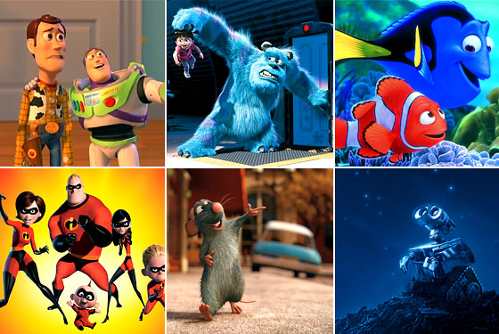
Pixar animation studios employs the 'Stone Soup' technique in their creative processes. In every little aspect on feature films the folks at Pixar collaborate. In the book To Infinity and Beyond: A Story of Pixar Animation Studios, I read about the way Pixar handles the processes of writing a story, designing characters, designing mood colors, backgrounds, and even designing the animated action and emotion of the characters in the film. These different aspects are gone over everyday with many artists, directors, story board artists, animators, and even the technical programmers. They are critiqued, analyzed, challenged and improved. Pixar does not miss a chance for greatness by confining any person to any role. They utilize the creativity in every single member of their unique team in every aspect of their film making.
The people of Pixar also know that they do need to please themselves as well. They need to remember who they are and the job they are doing, and not get too caught up in pleasing everyone else. By having a team they have a good balance of critique and unification. They have a common goal with different ideas about how to get there. The best ideas make it to the end, but most of those are combinations of many different people as they feed off of one another to create something brilliant. Stone Soup is the heartiest soup there is.

Friday, October 1, 2010

The Art of Lines

DSC_0067
Image from flickr user beatnikside


When I was a kid I went to Disneyland once a year. Disneyland is an amazing mixture of invention, design, artistry, fantasy and fun! The 1st time I remember really thinking about design was in Disneyland. It wasn't the cool landscapes or costumes the attendants wore. It wasn't the layout of the park or the themes of each area. It was the design layout and atmosphere of the places where you wait in lines.

Thinking about lines seems like a strange place for the thoughts of a child to be lingering, but waiting in lines is what you DO at Disneyland. I had been to many other parks, like Magic Mountain, Great America, and Marine World. Waiting in lines at those parks seemed like a much more boring prospect than the lines at Disneyland. I actually looked forward to waiting in the lines at Disneyland. I started to think about why. Could it be the memories? The time spent hanging with family while in line? The conversation? But all of those things existed at the other theme parks. Why then, were Disneyland lines so much more enjoyable?

It is the layout and the attention to detail. The entertainment and decoration. The involvement of the patron. Every line at Disneyland is considerably long. They say if you ride every major attraction at Disneyland one time, that you have walked 25 miles. 25 miles! The lines are set up in constantly curving, ever-changing, zig-zag mazes. The layout makes it impossible for you to tell how far you are from the front. This lack of knowledge allows you to more thoroughly enjoy what is around you.
Each line has a theme that matches the ride that you are about to embark on. The line for Space Mountain takes you deep inside a building that is futuristic and industrial. Futuristic vehicles suspend disbelief with their realistic details. Music and sound effects play all around you. The light is dim, and it seems as if you can see stars. So many things are going on to entertain you that before you know it, you are getting on the ride.

The lines are designed with physical comfort in mind. As you wait you are out of the sun, and in an air conditioned area, or at least under misters. There are no physical distractions to make the wait more apparent. Other techniques employed throughout the park are things like; secret messages that can be decoded, and short films that inform you about your upcoming adventure.

Walt Disney had it right. Design the lines to be a part of the ride.