Okay so not so design related, but my son is so silly! I am thinking of submitting this to AFV. There is a relation to design! Using tidbits of people's lives to design an experience. I don't know that I will ever be unable to find a connection....
Look at this video!
Thursday, December 30, 2010
Sunday, December 5, 2010
Des 001: Professor Housefield
 |
| Professor Housefield's photo taken from the UC Davis design websitehttp://design.ucdavis.edu/facstaff/current/housefield.html |
Professor Housefield was my 1st experience of UC Davis teachers. Having gone to Junior college since 1999, I really did not know what to expect. A more stiff teacher? A more rigorous, uninteresting program? NOT AT ALL. Housefiled was as entertaining as any reality show on TV (and I would totally watch one that followed him in his design and art filled life). I am hoping to link to a song that a fellow classmate mixed of his rap about Johannes Itten. He danced on the tables, tried to breakdance on the floor, and ran around in his socks. He made design an experience. I have a picture of my son with sky blue socks on and it makes me think of Professor Housefield's pretty socks. I will post it later. Thank you Housefield. Enjoy your kids and your vacation, and have fun writing your book. I look forward to taking more classes with you in the future.
Listen to the funk!
http://www.objectifiedfilm.com/objectified-trailer/
Some interesting topics from this quarter ^^
Sunday, November 28, 2010
Design is Dangerous: Christmas Tree Lights
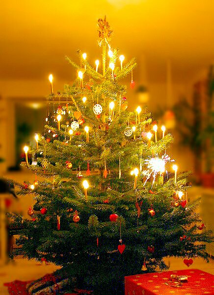 |
| Photo from allthingschristmas.comhttp://www.allthingschristmas.com/lights/tree-lights.php |
It's the time of year when my family pulls out dusty boxes full of ornaments, decorations, and lights. We scramble to get a tree together, fight over who has to put on the lights, whose turn it is to water the tree, and we try to keep the kids from breaking the heirloom ornaments. Designing the home to be a haven of christmas spirit and cheer against the nasty cold gray days, and freezing foggy nights, we put christmas lights up in the windows and on the tree. There are so many options of lights: rainbow, red, green, white, twinkling, bubbling, LED. We choose our lights according to taste and desired effect, but safety seems to have become less of a concern with the advances in technology. The lights do not burn so hot anymore, they aren't so big, or breakable. But they can still cause a fire. According to the U.S. Fire Administration, electrical fires from christmas trees account for 250 fires every year. While the problem generally arises from the user being inattentive to the thirst of their tree, the designers of christmas lights have certain responsibilities that they need to uphold to prevent fire or electrocution as much as possible. Look to see if your lights have a UL sticker on them. The Underwriters Laboratory Inc. regulates products for public safety. Check out this website for tips on safety.
The designers of christmas tree lights are not making something dangerous, they are making something beautiful and traditional, sentimental and inviting. But lights do pose a risk as any electrical device can. The problem really arises when the lights are placed in combination with a dry tree. The fire happens so fast. Look at this video of a tree catching fire in real time. These lights need to be safe as well as beautiful and the more education the designers can provide to their customers the better.
Designing Change: Wall E
The Disney Pixar movie Wall E is a movie that tries to change society by analyzing the road we are traveling into the future, but my focus is not to look at the warnings that Wall E seeks to provide, but rather to look at the construction of the case for the DVD. The entire case for the Wall E DVD is made of cardboard. There is not one bit of plastic. The case says on it's back that it is "Earth (and Space) Friendly Eco-Packaging." When searching for information on this packaging I came across a lot of negative reactions. People want their plastic cases, but Wall E stuck with it's principle and created the environmentally friendly packaging.
 |
| From Jon Taplin's Bloghttp://jtaplin.wordpress.com/2008/06/ |
I think to be a designer of any packaging at all is to take responsibility for the trash you will serve to create. When a new innovation is made people always resist, but I hope to see many more of these cases in the future (at least until everything is digital online, with no packaging whatsoever). Wall E shoves a mirror in the face of our consumer driven society, and asks us to take a look at what we are doing with all of the trash we create. I think that by sticking to it's message and creating a recyclable, biodegradable package that Pixar has once again used it's medium to make people think and learn, and it was done in a non-hypocritical manner. Changing society takes small steps. Designing change is a process of balancing what people want with what the world needs. This package heads in a good direction.
Babies: Color and Gender
To analyze color only by it's relation to it's surroundings is a difficult task, for as humans, we tend to want a steady answer, an ultimate truth. Color is not constant, it's character changes according to many factors. Albers main point in his book Interaction of Color is that color is subjective. Albers analyzes this fact in a very scientific manner, focusing on the interactions of color based on amount, tone, shade, tint, juxtaposition, and even the physical ability of the eye. I think that color is definitely subjective in this manner, but also in the sense of how and where you were brought up. There are too many societal and cultural implications of color, and too many personal responses based on life experiences, for emotional and environmental subjectivity to be left out of the equation. For example, while it is changing in our society, pink is indicative of a girl, and blue of a boy. This may be different in other cultures. That we see red as the hottest color must be cultural as well, because typically the hottest part of a flame is blue. So when I analyze a design and how color can transform it completely, I cannot separate the subjectivity of my life experiences. A really great example of color's subjectivity is baby products. Infants generally have little hair and they lack a lot of gender indicators. A parent will announce the baby's sex by dressing the baby in a manner that will let everyone know, "He's a baseball boy," or "She's a princess." Color is a very important indicator. Lavender, pink, hot pink, purple: these colors all say little girl. Dark blue, dark green, baby blue, orange: these colors all say boy. Obviously, if a child is wearing a dark blue dress, she is most likely a girl, so I will look only at one piece pajamas, and how their color can make a person decide on the gender of a child.
Choose a gender for each child. Why did you choose that gender? What if they were wearing something else?
We naturally decide that the one in pink is a girl, but if I dressed my 7 month old son in pink, I am sure that people would assume he is a girl as well. The girl in yellow could easily be a boy, but she has a bow in her hair. We look for all of these cues to make a judgment, and color is a cue.
There are also gender neutral colors. Usually sage green, white, yellow, and red are gender neutral. All of these colors can be applied to a form of clothing that is indicative of sex and that would change the rules, but in it's most basic form of clothing, color identifies sex (at least in infants).
 |
| Image from Mom's Favorite Stuff posted by JODIhttp://www.momsfavoritestuff.com/2008/08/20/velcro-baby-pajamas-for-easier-nights/ |
We naturally decide that the one in pink is a girl, but if I dressed my 7 month old son in pink, I am sure that people would assume he is a girl as well. The girl in yellow could easily be a boy, but she has a bow in her hair. We look for all of these cues to make a judgment, and color is a cue.
There are also gender neutral colors. Usually sage green, white, yellow, and red are gender neutral. All of these colors can be applied to a form of clothing that is indicative of sex and that would change the rules, but in it's most basic form of clothing, color identifies sex (at least in infants).
Monday, November 15, 2010
The Graduate
Designing a bar can be a key ingredient to getting and keeping customers, as well as advertising the crowd the owner wishes to attract. People are naturally concerned with fitting in. They group themselves with a certain type of person. This may be stereotypical, but it is psychological. Gestalt psychology tells us that the brain tends to group things by similarity. This creates stereotypes. One can assume that the style of a place or a person can be indicative of what they are and who they will associate with. With this knowledge unconsciously in mind, one chooses their attire and decor to make a statement. They communicate so much about themselves or as in the case of a bar, their intended patron.
The Graduate has imposing doors. I wasn't sure if I could go in, or if I was in the right place, but once inside the feeling was comfortable, relaxed, and loud. The giant TV's playing all different sports and the line style food ordering were elements that made the bar friendly. The dimness of the lighting ensures one's focus will be on the T.V's and the casual seating mixed with the traditional bar style seating give the patron a choice of what focus they intend for their visit. Will I eat? Will I take a shot?
The way college towns are portrayed notoriously in teen comedy led me to believe that a bar in Davis would be a 'meet' market. A place for younger college students to drink and dance and hook up. That was my stereotypical vision. After I entered the graduate I found that I was surprised and happy to see that there is a bar here that is reminiscent of home. My age did not stand out (I am 29), and I even got I.D.'d. The designers of that bar were looking to attract a laid back casual crowd interested in sports, good food, and beer. Now that I have been to the Graduate and learned the stereotype of the bar, I can safely say I will go back, and that I need to double check my stereotypical thinking (Gestalt *sigh*).
 |
| The Graduate Menu and Front Doorshttp://www.davisgrad.com/images/menu-back-news.jpg |
Sunday, November 14, 2010
Wii Controller
 |
| Nintendo Wii Controller http://us.wii.com/hardware/ |
 |
| Nintendo Wii nunchuk http://us.wii.com/hardware/ |
The Holidays are coming and the Wii is on our list! I started thinking about the controller for the Wii and how it really has changed the face of gaming. The designers of the controller not only came up with the idea of a motion sensor controller, but they have upgraded and adjusted the controller according to user needs, comfort, safety, ease of use, performance, and aesthetics. This video is a very enlightening instruction on how to use the controller, but with it came some insights about safety and ease of use. The Wii controller is long and narrow like a remote control for a TV. It has similarities to the controllers of old, but is simpler and held at a different angle. The controller has a directional key and a few different buttons, but what makes it so different is the sensor in the end of the controller. The user points the controller at the screen and can use it like a mouse for a computer. The controller also has motion sensors that can take the physical motion of the user and translate it to action. Meaning you can turn the controller on it's side and hold it with two hands, then by tilting the controller one way or another you can control the way a car (for example) will turn. The controller also has an accessory called a nunchuck. The nunchuck attaches by a cord to the Wii controller and is held in the opposite hand. It has an analog stick that is used to easily move a character within a game, and has additional buttons.
The comfort of the Wii controller is easy to see. The size fits nicely in the hand, and the nunchuk is ergonomically shaped to fit perfectly with your hand. The length of the connecting cord is not too long or too short and does not interfere with game play.
The controller is fairly easy to use. A few moments of playing with it and a little background knowledge of computers or video games and one is already an expert. Part of the fun of the Wii is that you have to move. Normal video games are fairly immobile. The user sits in front of the TV and moves only their thumbs and eyes, but the Wii requires full range of motion from arms and even sometimes the whole body. Many people stand while they play. So it is easy to use, but not stagnant which may cause some to say that it is more difficult because they have to use their body. This is a good thing for the next generation of kids as they develop and stay active even as they play their video games!
As far as performance, the Wii does what it should. Anything can be faulty over time, so I will reserve complete judgement until I actually have the Wii for a little while. The Wii responds to the controller effectively and allows the user to play their games in an animated and exciting new way.
Aesthetically the Wii controllers are perfect for what they intend. Their design does not state itself. One focuses more on the use of the object rather than what it looks like which is what a product should do. It should speak to what it does. While functionality is the focus, the design is very smooth, shiny, simple, and indicates its purpose. All of its edges are rounded. Even though the controller is a rectangle there are no hard edges. The nunchuck is curvilinear and small, highlighting it's usability. The white color is very popular for a very contemporary feel as can be seen in things like the iMac, Eve from Wall-E, and IKEA products. Nintendo does offer additional colors, allowing their users to personalize their products to their own tastes. The Nintendo designers are doing a wonderful job. They are coming up with new ways to think about gaming and they listen to the needs of their users, changing and improving their products in a constant design conversation.
 |
| Eve from Disney|Pixar's Wall-E http://myonlinereviewer.com/movies/animated/wall-e-deeper-than-you-think.html |
Saturday, November 6, 2010
Design Implementation: Brian Fies
Tools have a purpose. Design has many purposes. I think the ability of design to reach other people is amazing. Brian Fies was an inspiring speaker. His work has so much meaning. He used many tools of design to create a design tool. A tool that reaches people. To make a difference in this world is to reach people. By putting a smile on someone's face you can change the rest of their day, or week, or life. In my day to day routine I try to remember this and live by the knowledge that just being polite can help someone. Brian Fies has helped countless people with his book Mom's Cancer. His ability to realistically relate the feelings and problems that a family has as they go through cancer, has made me feel connected and understood. I am sure countless others have taken the same feelings with them after they have read this book. The feelings of guilt and anger, frustration and fear all combine to make a person feel very alone. My mother had cancer and was fortunate enough to survive, although her prognosis was dim. I went through a lot of these things. Brian Fies expresses these feelings with such clarity and humor. His devices make the story beautiful, touching, and real. The Frankenstein's lab scene infuses humor with serious fear, and conveys so much meaning by it's context and simplicity. His attention to detail and truth makes this story REAL. Thank you Brian Fies. You are an inspiration. I hope to one day inspire others in such a significant way.
Buy Mom's Cancer on amazon.com (I bought 2!)
Buy Mom's Cancer on amazon.com (I bought 2!)
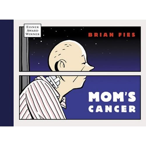 |
| Cover from Brian Fies book Mom's Cancer http://ecx.images-amazon.com/images/I/51vniiiAEmL._SS500_.jpg From amazon.com |
Word and Image: Separate?
To think about word and image is to separate their meanings, but that is a difficult concept to really comprehend. Signifiers are the mental concepts for signified objects, actions, etc. That seems straight forward enough. A word is a signifier for an object. But the letters of the word and the word itself are signifiers for sounds that represent concepts. These words are images. Their style, shape, size, readability all convey more than their conceptual meaning. A single page of text in a book conveys meaning without even having any knowledge of the content of the book. If the font is large, one can assume that it will be an easier book to read. If the font is very fresh and dynamic, one would assume a more modern book. If a font is heavy and decorative, one can assume an older book or a book trying to portray age. The alignment of the text can indicate the form of the writing. Centered? Spaced out? Could be a poem or a children's story. Numbered? Bulleted? Could be informational. I have at times seen patterns in the spacing of words, or traced swooping lines through pages of text. To analyze word and image as an assignment is to assume that the subjects, are somehow separated from one another. While I do believe a word can portray it's meaning without the visual aspects of the word interfering, meanings are inferred by the form the word takes.
Spoken word is another interesting idea to consider. Analyze word and image? That could be a movie without any text. The spoken word conveys meaning more than it's concept by adjusting tone, volume, or pitch. Even more meaning is added when a visual of the person speaking the words is accompanied with the words. You can perceive attitude, age, or even station, and add symbolic inferences to what the speaker means because of what they wear or look like.
Analyze word and image? In a sense, if one is to really think about the concept that this assignment is expecting, one can almost say... Word and image are the same thing; symbolic representations created by men and women to convey meaning, to tell a story.
Moulin Rouge Film Ending watch here
This has so many meanings that are conveyed through song (word) and visual emotions on the faces of the actors, as well as the sets, and costumes. If a person had never seen this movie, they would be able to glean a lot of information from this one scene.
 |
| Stele of Minnakht, chief of the scribes. during the reign of Ay (c. 1321 BC) http://en.wikipedia.org/wiki/File:Minnakht_01.JPG |
Analyze word and image? In a sense, if one is to really think about the concept that this assignment is expecting, one can almost say... Word and image are the same thing; symbolic representations created by men and women to convey meaning, to tell a story.
Moulin Rouge Film Ending watch here
This has so many meanings that are conveyed through song (word) and visual emotions on the faces of the actors, as well as the sets, and costumes. If a person had never seen this movie, they would be able to glean a lot of information from this one scene.
Lark Pien: Word & Image

Image from blueapplebooks.com
Cover of Long Tail Kitty by Lark Pien
In Lark Pien's work word and image combine to tell captivating, cute, and witty stories. She started out creating mini comics and has adapted her work to create children's books. Her 1st book, Long Tail Kitty, is in the format of a comic book, but it is a children's book with a hard cover and soft watercolor illustrations. Her work has taken comic books to a younger level, while still remaining fun for an adult. My daughter is 4 years old and she can understand the story in a basic way without needing to read. This formatting disseminates comic style reading to young children in a simplistic way. There have been other comic style children's books that I have seen, but they mostly take the adolescent version and put it into a board book. Long Tail Kitty has the feel of a child's book. With whimsical illustrations and silly antics, Long Tail Kitty speaks to children. When Pien's words combine with her images there are layers of understanding demonstrating more than 'surface.' The witty attitude speaks to children and adults alike with it's exploration of abstract concepts and creative humor. Lark Pien has brought comic style reading to a younger generation of people and has used her art and creativity to incite a lifelong love for comics. She forges the way for the next generation of Comic Con attendees, and opens the doors to achieving a more widely understood style of communication. I had the pleasure of seeing her original artwork on display at the Cartoon Art Museum in San Francisco in the exhibit Story Time! Graphic Novels for Kids of All Ages. The exhibit had a wide variety of graphic novel and comic artists on display, but none was as captivating as Lark Pien's cute stylized work. Her process and sketch work was on display, along with some original artwork. Reading about her process really demonstrated how she uses word and image to equal so much more than the sum of their parts. She creates while in the process, and learns the story herself as she draws. For creating the book she had to draw word bubbles separately from the illustrations, and the actual words separate from the bubbles. The creative process is so different from the final production process. Freely exploring and then refining combine, just as word and image combine, to make a complete whole.
 |
| Lark Pien's Long Tail Kitty mini comic. For a full version see her website archives |
Read an interview with Lark Pien
Read Lark Pien's blog
Monday, November 1, 2010
Designing Experiences: Thanksgiving Dinner
 |
| Photo from Manolo for the Home http://manolohome.com/2010/11/ |
 |
| Image from Yanko Design http://www.yankodesign.com/ |
Then the clean up begins. Most people head off to the TV or maybe to play a card game. As many people as can fit in the kitchen are organized into jobs for cleaning. Food is put away and separated for leftovers. Everything is washed and cleared. Later dessert is served to everyone in their respective locations. Eventually everyone rounds up their sleepy kids and their leftovers, gives hugs and kisses and many thanks, and heads out into the cold to drive home for the night. Each and every person full, happy and oblivious to the thoughtful, tedious design that they just experienced. Great design is not noticed as designed. When Thanksgiving Dinner starts to be held at my house I hope I can make it look as effortless as my mother-in-law does.
Thanks to all those designers who make the holidays grand!
http://www.bhg.com/holidays/thanksgiving/planning/
An interesting website to help design the Thanksgiving experience
Plackers Picked Apart
 |
| Image from Orbis Distribution Inc http://www.orbisdistribution.com/products/ |
Looking at Plackers flossers I started thinking about sustainability and the toothbrush on Objectified. I decided a formal analysis of this simple little daily ritualistic piece of plastic could be an enlightening endeavor. The designer(S) have put a lot of thought and effort into the effortlessness of this simple device. I floss daily. It is very important to do, and thankfully the habit has stuck with me for over two years. It was a long road, though. Flossing is an easy thing to skip. Many people do. One thing that has made it easier is these nifty little Plackers. The ease of use as opposed to rolled and held floss is, for me, priceless. The size of the Placker is perfect for reaching the back teeth and fitting into the mouth. The span of floss leaves enough room to squeeze in between teeth. The angle that the head of the Plackers slants makes it easy to use. There is a textured portion of the handle to make gripping easier, and the tip of the handle is made to easily break apart leaving a pointy toothpick for those really annoying peices of food that you just can't get with floss. The fact that it breaks apart keeps the tip safely rounded until needed. The floss is shred resistant and comes in extra thin versions for tight teeth. They can be mint flavored, and the color is indicative of mint and has associations with cleanliness and good breath. The name Plackers is a clever name as well. Playing on plaque and plucker, the name is perfect for the device.
As far as sustainability is concerned, these are not very "green." I was thinking that a refillable version could be an answer, but then I found that someone beat me to the punch. I will be looking into a more earth friendly version for myself. Here a few that I have found.
http://www.gripit.biz/index.cfm/id:44
http://www.flossgrip.com/index.html
http://www.goharmon.com/070942304085.html
If you don't floss you should! Plackers are cheap nifty little guys and can be bought anywhere for a couple of dollars. Good Design means form follows function.
Sunday, October 31, 2010
FOcontentRM: Objectified
 |
| Image from Tech Fresh http://www.techfresh.net/ |
Designers represent people. They create for an audience, but also for themselves and their personal aesthetic. Each designer represents the group of people that have a similar aesthetic or need. As Rob Walker says, companies want SKU's. They want more products to put on the shelf and sell. Because of this designers also have a responsibility to future generations. They have an ethical responsibility to create sustainably.
 |
| Image from treehugger.com http://www.treehugger.com/ |
Objectified uses designers philosophies, shots of products, and people using products to ask the question... "What is the purpose of design?" "Where should design be headed?" Form and Content interact in this film by portraying images of new products being manufactured for masses of people and depicting the future resting place of the new products by showing older versions broken down and heading to a landfill. The film uses these juxtaposed processes to portray the content. What are objects? What is the responsibility of the designer? The consumer? What are you (the viewer) going to do with this information?
Watch this video on the evolution of cell phones. Scroll down.
http://cellphones.techfresh.net/evolution-of-mobile-phones/
Friday, October 15, 2010
Designing Fear
 |
| Image from Popcorn Monster http://www.popcornmonster.com/2009/09/27/top-10-classic-horror-films/ |
Horror Movies exist in a highly criticized genre of entertainment. Opinion is widely ranging and fascinating because of the implications. A person's choice of horror films can be indicative of what that person fears, and how their imagination works.
My favorite horror films are the ones that leave a lot to the imagination. A dark corridor and a growling noise is infinitely more scary to me than to watch than an array of special effects that realistically (or unrealistically) portray a demon, monster, or grotesque death.
Looking at the genre of the supernatural (See! Didn't I say preferences are indicative of a person's fears?) I will compare and contrast the techniques used to design an experience. I will look at the movies Paranormal Activity and Final Destination.
Paranormal Activity is filmed as if it is a home movie. The effects are limited to footprints in baby powder, a door slamming, and loud noises among others that are equally simple. The build up of fear is created by the back story, the progression of small happenings, and the seemingly real style of movie. With so much left to the imagination, a mind that is creative can build on it's own fears.
Final Destination is a movie full of special effects. Crazy things happen again and again. The effects are realistic and convincing, and the pace of the movie is instant and consistent. There is no need to be creative or use your imagination because every detail is laid out.
I loved Paranormal activity. It was a movie designed with an imaginative person in mind. Final Destination was not designed to scare ME, but I imagine there are others who would respond to these movies in the opposite way that I do. Fear is designed with it's audience in mind. "What's your favorite scary movie?" (Scary Movie, 2000).
Trailor for Paranormal Activity
http://www.popcornmonster.com/2009/09/27/top-10-classic-horror-films/
A fun site!
Design as a Conversation
When we think about the meaning of the word conversation, we think of a back and forth exchange of information between people. Design is a means of conversation. It is a way to communicate information to people, but more importantly the people can communicate back by indicating their reaction to a design. The designer is then moved to change or add to their design to communicate more effectively.
When thinking of design as a conversation, and trying to find an easily noticeable example, I can't help but think of TV shows where the viewers are invited to watch and vote. American Idol is one example, but my favorite is America's Got Talent.
When I watch America's Got Talent, I am the listener in a conversation. I am taking in the information that is designed to be watched by the directors and contestants of and in the show, and I am analyzing it. I judge the contestants' performances, and laugh at the silly cuts that the director adds in. At this point I am an observer.
To a certain extent designers are always affected by the public. When designers are communicating whatever it is they mean to get across, they have to make sure that they will have an interested audience, and to do so they must take the audiences' desires into consideration. But in a show like America's Got Talent, the observer becomes a more direct participant in the design conversation. The audience is invited to vote for their favorite. The winning contestant gets a show in Vegas. In essence, the audience is designing the outcome of the show and also the upcoming Vegas show that will be available for them to attend. Effectively, the audience becomes the speaker in the conversation. All design works in this same way. America's Got Talent is just a more obvious conversation.
Fighting Gravity was a favorite of mine this year on America's got talent! Watch this video here or click here
America's Got Talent is coming on again. Think creatively... what could a designer do that could be a Vegas show?
Got an idea? I say AUDITION! http://americasgottalentauditions.com/new/la
When thinking of design as a conversation, and trying to find an easily noticeable example, I can't help but think of TV shows where the viewers are invited to watch and vote. American Idol is one example, but my favorite is America's Got Talent.
 |
| Image from Pop Tower http://www.poptower.com/ |
When I watch America's Got Talent, I am the listener in a conversation. I am taking in the information that is designed to be watched by the directors and contestants of and in the show, and I am analyzing it. I judge the contestants' performances, and laugh at the silly cuts that the director adds in. At this point I am an observer.
To a certain extent designers are always affected by the public. When designers are communicating whatever it is they mean to get across, they have to make sure that they will have an interested audience, and to do so they must take the audiences' desires into consideration. But in a show like America's Got Talent, the observer becomes a more direct participant in the design conversation. The audience is invited to vote for their favorite. The winning contestant gets a show in Vegas. In essence, the audience is designing the outcome of the show and also the upcoming Vegas show that will be available for them to attend. Effectively, the audience becomes the speaker in the conversation. All design works in this same way. America's Got Talent is just a more obvious conversation.
Fighting Gravity was a favorite of mine this year on America's got talent! Watch this video here or click here
America's Got Talent is coming on again. Think creatively... what could a designer do that could be a Vegas show?
Got an idea? I say AUDITION! http://americasgottalentauditions.com/new/la
Comparison and Contrast
 |
| Me and my daughter at Disneyland (my son is in my belly). Photo taken by Sean Murphy (my husband). |
It is that cold, dark, spooky time of year, and as Halloween quickly approaches I find myself looking for creepy decorations and horror movies. I love a good thrill, but some of the best spine tingling experiences that I have ever had come from books. Children's books! My favorite books to read as a child were scary story anthologies. I would scour the library for all of the creepy story books, and I would relish in the illustrations. As an adult my interest in these illustrations and stories has not waned, and I own some of my favorites including the "Scary Stories" series by Alvin Schwartz and the "Short and Shivery" books by Robert San Souci. The stories in these books have equal appeal as they are mostly adapted stories and legends from different parts of the world. What strikes me is the illustrations. The "Scary Stories to Tell in the Dark" book illustrations, by Stephen Gammell, are drawn in a monochromatic range of grays. The illustrations seem soft and out of focus and stringy lines ooze out of unexpected places. The "Short and Shivery," books are illustrated by Katherine Coville and the illustrations are also black and white (excluding the cover), but they are drawn with thick outlines and precise clarity.
To analyze these book designs I will use a specific illustration from each book. These two illustrations will describe the general feel of the books and serve to communicate the design of each book. I chose illustrations that are created for very similar stories. The stories tell of a girl who is dared to enter a graveyard, some how gets caught by her clothing, and is unable to run away. The girl dies of fright.
 |
| Illustration from Scary Stories to Tell in the Dark Drawn by Stephen Gammell Image http://scourgedaggerandchain.wordpress.com/page/3/ |
This illustration is from "Scary Stories," drawn by Stephen Gammell. It is a drawing of a girl in the action of screaming. The contrast of the light background and the dark figure place the figure as the focal point. The slightly off central position of the figure lends to an uneasy feeling, but balance is maintained by the dark linear grass creeping up toward the figure's body. The smudgy soft focus and lack of any out-lines create an unsettling world. The hair of the figure repeats the weedy grass in its strange, undulating, thin-line motif. The connecting filaments of dark ink create an odd environment.The image is a wonderful example of the others in this book, and is a testament to the work of Stephen Gammell and his ability to create an edgy, tense, creepy illustration.
 |
| Illustration scanned by me Drawn by Katherine Coville From the book Short and Shivery |
I enjoy both illustrations in a different way. I appreciate Coville's describing and fanciful illustrations for their skill and beauty. Gammell, is an amazing artist because he is so great at creating an unreal, horrific, fantasy world by playing with the human sense of reality.
Happy Halloween!
Happy Halloween!
Sunday, October 10, 2010
Art Cars!
 |
| All photos taken by me |


They had a grand re-opening of the Crocker Art Museum in Sacramento today. Unfortunately it was so crowded that I could not enjoy the interior. I will have to go back again soon.
What I did enjoy was the shady, open, grass area right next to the Crocker. It was filled with cars. Art Cars. These cars were creative and amazing! They were cars transformed into designs of any subject matter that filled the designers heads. There was a lady bug, a butterfly, an angler fish, a giant Radio Flyer, and a squirrel infiltrated car (to name a few). Here were people who took inspiration from without, and created such a variety of spectacles that it was hard to stop looking. These people wanted to make their cars, art cars.
In some cars you could see where the inspiration started. The butterfly, for example, was a Volkswagon Bug. The play on the name of the car and the little rounded, playful shape was obviously what inspired this designer. The theme of nature was directly related to the idea of an insect. In addition, Volkswagon bugs are known for their bright colors, and the designer of this car utilized that fact in their design.
The angler fish car took it's inspiration from something less obvious. The grill of the car is where the teeth project from, and the eyes are the windshield. This is a common perception that humans have. We apply our (or other live creatures') features to inanimate objects. Grill and windshield become eyes and mouth.
Some cars were purely whimsical, and others sought to portray political agendas. These designs (and designers) were as varied as you could imagine, but they were all inspired by the desire to create an ART car.
Check out the website, there are a lot of other cars that I didn't even get to see!
Friday, October 8, 2010
"Creativity from Without"
 |
| Image from Christo and Jeanne Claude's website http://www.christojeanneclaude.net/ |
Jeanne Claude and Christo are designers/artists that find inspiration from 'without.' Their work is difficult to categorize because they do not categorize it themselves. The work they do is large scale installations that are meant to be temporary. They create works that are inspired by, and meant to have a conversation with, the environment in which they are set.
The words large scale don't encompass the vastness of their designs. Running Fence was 18 feet high and 24 1/2 miles long. It was a fence created from canvas that curved and flowed and meandered through the hills of private ranchers and farmers in Sonoma and Marin counties, finally terminating in Bodega Bay.
The project was meant to be viewed in real life. It was up for only 14 days in 1976. Those who were able to experience this work would have a better analysis, but because I can only go by photographs, my analysis may not be as impressive as one that was given by a person who witnessed this project.
The roaming, rolling, free hills of northern california are beautiful, and inspire a feeling of vastness and freedom. Running Fence is like a highlighter. It draws attention to what so many take advantage of everyday. It illuminates the wide open rolling green hills. It meanders and rolls with them. The choice of fabric allowed for the bay winds to enliven the composition. The color of the canvas contrasted the darker grass, and reflected the beautiful changes of light throughout the day and night.
To take inspiration from nature and environment is a common way artists find inspiration from without. The way that Jeanne Claude and Christo applied that inspiration was unique. They wished to use the landscape by engaging with it.
For more information and to view the source of the information in this blog visit http://www.christojeanneclaude.net/rf.shtml
Thursday, October 7, 2010
Stone Soup
 |
| Image from NY mag http://nymag.com/ |
The principle and idea behind Stone Soup is: 'the more people the better.' The more ideas that are thrown around by people with different perspectives and backgrounds, the more unique and multifaceted the final product will be. In the design world working together has to be important. When you design, you are designing for an audience, not yourself.
Pixar animation studios employs the 'Stone Soup' technique in their creative processes. In every little aspect on feature films the folks at Pixar collaborate. In the book To Infinity and Beyond: A Story of Pixar Animation Studios, I read about the way Pixar handles the processes of writing a story, designing characters, designing mood colors, backgrounds, and even designing the animated action and emotion of the characters in the film. These different aspects are gone over everyday with many artists, directors, story board artists, animators, and even the technical programmers. They are critiqued, analyzed, challenged and improved. Pixar does not miss a chance for greatness by confining any person to any role. They utilize the creativity in every single member of their unique team in every aspect of their film making.
The people of Pixar also know that they do need to please themselves as well. They need to remember who they are and the job they are doing, and not get too caught up in pleasing everyone else. By having a team they have a good balance of critique and unification. They have a common goal with different ideas about how to get there. The best ideas make it to the end, but most of those are combinations of many different people as they feed off of one another to create something brilliant. Stone Soup is the heartiest soup there is.
Friday, October 1, 2010
The Art of Lines

Image from flickr user beatnikside
Thinking about lines seems like a strange place for the thoughts of a child to be lingering, but waiting in lines is what you DO at Disneyland. I had been to many other parks, like Magic Mountain, Great America, and Marine World. Waiting in lines at those parks seemed like a much more boring prospect than the lines at Disneyland. I actually looked forward to waiting in the lines at Disneyland. I started to think about why. Could it be the memories? The time spent hanging with family while in line? The conversation? But all of those things existed at the other theme parks. Why then, were Disneyland lines so much more enjoyable?
It is the layout and the attention to detail. The entertainment and decoration. The involvement of the patron. Every line at Disneyland is considerably long. They say if you ride every major attraction at Disneyland one time, that you have walked 25 miles. 25 miles! The lines are set up in constantly curving, ever-changing, zig-zag mazes. The layout makes it impossible for you to tell how far you are from the front. This lack of knowledge allows you to more thoroughly enjoy what is around you.
Each line has a theme that matches the ride that you are about to embark on. The line for Space Mountain takes you deep inside a building that is futuristic and industrial. Futuristic vehicles suspend disbelief with their realistic details. Music and sound effects play all around you. The light is dim, and it seems as if you can see stars. So many things are going on to entertain you that before you know it, you are getting on the ride.
The lines are designed with physical comfort in mind. As you wait you are out of the sun, and in an air conditioned area, or at least under misters. There are no physical distractions to make the wait more apparent. Other techniques employed throughout the park are things like; secret messages that can be decoded, and short films that inform you about your upcoming adventure.
Walt Disney had it right. Design the lines to be a part of the ride.
Thursday, September 30, 2010
Old Possum's Book of Practical Cats
 |
| Image from Favini Costume Design http://www.favinicostumedesign.com/ |
T.S. Elliot wrote an adorable anthology of poems about cats called Old Possum's Book of Practical Cats. Andrew Lloyd Weber adapted the poems (among others) to create a musical. I got to see the musical performed last summer in Sacramento. Beautiful costumes, amazing sets, and emotionally moving music combine to make an artistic and visually exciting play.
In McCloud's book, Understanding Comics, McCloud describes the unique combination that comic books use to tell a story; words, pictures, time, and space. I think that this form of analysis should be applied to more areas of design. Musicals combine different elements, but I think it is the same kind of special combination of art and design. Musicals combine story, song, music, dance, costume, and set design. These different aspects can stand alone (as in comics), but as a whole, a new universe is created with the design of a musical.
In The Musical Cats, costume design is as important as the songs. The human form is taken into consideration and then applied with feline characteristics. The mobility and sleekness of cats is conveyed through slender form fitting costumes, and cat-like human qualities conveyed with symbolic cultural dress. For example; the costume of Grizabella the Glamour Cat (an old, worn, tired and lonely, once glamourous, stray cat) is conveyed by portraying a cat-like bag lady. The bag lady is depicted by drawing on the stereotype of an older woman who pushes a cart down dirty streets wearing filthy, over sized clothes that were once glamourous as she herself may have been. Her loss of youth, beauty and possibly sanity apparent in her choice of dress. Using these emotional stereotypical cues Paul Favini created timeless characters whose personalities were communicated with their dress alone. The feel of the musical is tied together by the costumes.
The choreography and movement of the actors and actresses expresses feline motion, the songs convey mood, the lyrics evoke feline concerns, and the set places the characters and scales them to size by using unusually large props, but the musical would be a miss without the design of the costumes by Paul Favini. (The image is Paul Favini's artwork for the costume design of Grizabella)
Sunday, September 26, 2010
A Big Job
 |
| Photo taken and masked by me |
When thinking of defining the word design, I think it is also appropriate to consider the job or jobs of the designers. There are the jobs that we readily pull up from our brain database: Graphic Designer, Clothing Designer, Web Designer, Interior Designer, and Architect (to name a few). What about those jobs that we don't readily think of? These can be jobs like teaching design (designing the curriculum for the classes), designing books (layouts, covers, illustrations), designing applications (iphone, iMac) and designing toys (barbies, Nintendo). What about those really amazing designs that we utilize everyday and we don't even recognize that they are designs?
Ever been on a nature trail? The kind that has little signs telling you about the nature that you are looking at? Who created the trails? Who designed them? Who invented the concept of the trails? What about toilet paper? Someone designed those little quilted flower patterns, and the roll that the paper is on, and the perforated sheets. Someone invented the toilet paper. But before the toilet paper there were toilets (or at least outhouses). Someone designed them, Someone invented them. Design and invention are constantly feeding one another, building upon their prior achievements, improving usability and allure.
I think design and invention go hand in hand. Maybe the ideas come from inventors and the application of the ideas comes from the designers. Maybe the designer is the inventor or vice-versa. Invention leads to design; design communicates invention. The person who created/invented Pepsi may have designed the flavor and color of the product, but a designer created the bottle that carries it, and the logo that sells it. The job of a designer is a big job. Whether that is to make more people aware of a great invention by designing an advertisement, or to design a new desk that is more ergonomically correct, Designers are responsible for sharing, communicating, and shaping the inventions and products that advance our society.
Subscribe to:
Comments (Atom)