Sunday, November 28, 2010

Design is Dangerous: Christmas Tree Lights

Photo from allthingschristmas.comhttp://www.allthingschristmas.com/lights/tree-lights.php

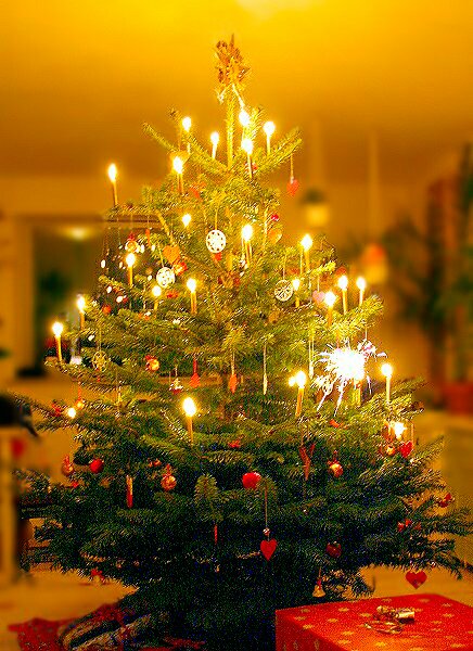
It's the time of year when my family pulls out dusty boxes full of ornaments, decorations, and lights. We scramble to get a tree together, fight over who has to put on the lights, whose turn it is to water the tree, and we try to keep the kids from breaking the heirloom ornaments. Designing the home to be a haven of christmas spirit and cheer against the nasty cold gray days, and freezing foggy nights, we put christmas lights up in the windows and on the tree. There are so many options of lights: rainbow, red, green, white, twinkling, bubbling, LED. We choose our lights according to taste and desired effect, but safety seems to have become less of a concern with the advances in technology. The lights do not burn so hot anymore, they aren't so big, or breakable. But they can still cause a fire. According to the U.S. Fire Administration, electrical fires from christmas trees account for 250 fires every year. While the problem generally arises from the user being inattentive to the thirst of their tree, the designers of christmas lights have certain responsibilities that they need to uphold to prevent fire or electrocution as much as possible. Look to see if your lights have a UL sticker on them. The Underwriters Laboratory Inc. regulates products for public safety. Check out this website for tips on safety.
The designers of christmas tree lights are not making something dangerous, they are making something beautiful and traditional, sentimental and inviting. But lights do pose a risk as any electrical device can. The problem really arises when the lights are placed in combination with a dry tree. The fire happens so fast. Look at this video of a tree catching fire in real time. These lights need to be safe as well as beautiful and the more education the designers can provide to their customers the better.

Designing Change: Wall E

The Disney Pixar movie Wall E is a movie that tries to change society by analyzing the road we are traveling into the future, but my focus is not to look at the warnings that Wall E seeks to provide, but rather to look at the construction of the case for the DVD. The entire case for the Wall E DVD is made of cardboard. There is not one bit of plastic. The case says on it's back that it is "Earth (and Space) Friendly Eco-Packaging." When searching for information on this packaging I came across a lot of negative reactions. People want their plastic cases, but Wall E stuck with it's principle and created the environmentally friendly packaging. 
From Jon Taplin's Bloghttp://jtaplin.wordpress.com/2008/06/
I think to be a designer of any packaging at all is to take responsibility for the trash you will serve to create. When a new innovation is made people always resist, but I hope to see many more of these cases in the future (at least until everything is digital online, with no packaging whatsoever). Wall E shoves a mirror in the face of our consumer driven society, and asks us to take a look at what we are doing with all of the trash we create. I think that by sticking to it's message and creating a recyclable, biodegradable package that Pixar has once again used it's medium to make people think and learn, and it was done in a non-hypocritical manner. Changing society takes small steps. Designing change is a process of balancing what people want with what the world needs. This package heads in a good direction.

Babies: Color and Gender

To analyze color only by it's relation to it's surroundings is a difficult task, for as humans, we tend to want a steady answer, an ultimate truth. Color is not constant, it's character changes according to many factors. Albers main point in his book Interaction of Color is that color is subjective. Albers analyzes this fact in a very scientific manner, focusing on the interactions of color based on amount, tone, shade, tint, juxtaposition, and even the physical ability of the eye. I think that color is definitely subjective in this manner, but also in the sense of how and where you were brought up. There are too many societal and cultural implications of color, and too many personal responses based on life experiences, for emotional and environmental subjectivity to be left out of the equation. For example, while it is changing in our society, pink is indicative of a girl, and blue of a boy. This may be different in other cultures. That we see red as the hottest color must be cultural as well, because typically the hottest part of a flame is blue. So when I analyze a design and how color can transform it completely, I cannot separate the subjectivity of my life experiences. A really great example of color's subjectivity is baby products. Infants generally have little hair and they lack a lot of gender indicators. A parent will announce the baby's sex by dressing the baby in a manner that will let everyone know, "He's a baseball boy," or "She's a princess." Color is a very important indicator. Lavender, pink, hot pink, purple: these colors all say little girl. Dark blue, dark green, baby blue, orange: these colors all say boy. Obviously, if a child is wearing a dark blue dress, she is most likely a girl, so I will look only at one piece pajamas, and how their color can make a person decide on the gender of a child.
Image from Mom's Favorite Stuff posted by JODIhttp://www.momsfavoritestuff.com/2008/08/20/velcro-baby-pajamas-for-easier-nights/
Choose a gender for each child. Why did you choose that gender? What if they were wearing something else?
We naturally decide that the one in pink is a girl, but if I dressed my 7 month old son in pink, I am sure that people would assume he is a girl as well. The girl in yellow could easily be a boy, but she has a bow in her hair. We look for all of these cues to make a judgment, and color is a cue.
There are also gender neutral colors. Usually sage green, white, yellow, and red are gender neutral. All of these colors can be applied to a form of clothing that is indicative of sex and that would change the rules, but in it's most basic form of clothing, color identifies sex (at least in infants).

Monday, November 15, 2010

The Graduate

Designing a bar can be a key ingredient to getting and keeping customers, as well as advertising the crowd the owner wishes to attract. People are naturally concerned with fitting in. They group themselves with a certain type of person. This may be stereotypical, but it is psychological. Gestalt psychology tells us that the brain tends to group things by similarity. This creates stereotypes. One can assume that the style of a place or a person can be indicative of what they are and who they will associate with. With this knowledge unconsciously in mind, one chooses their attire and decor to make a statement. They communicate so much about themselves or as in the case of a bar, their intended patron.
The Graduate has imposing doors. I wasn't sure if I could go in, or if I was in the right place, but once inside the feeling was comfortable, relaxed, and loud. The giant TV's playing all different sports and the line style food ordering were elements that made the bar friendly. The dimness of the lighting ensures one's focus will be on the T.V's and the casual seating mixed with the traditional bar style seating give the patron a choice of what focus they intend for their visit. Will I eat? Will I take a shot?
The way college towns are portrayed notoriously in teen comedy led me to believe that a bar in Davis would be a 'meet' market. A place for younger college students to drink and dance and hook up. That was my stereotypical vision. After I entered the graduate I found that I was surprised and happy to see that there is a bar here that is reminiscent of home. My age did not stand out (I am 29), and I even got I.D.'d. The designers of that bar were looking to attract a laid back casual crowd interested in sports, good food, and beer. Now that I have been to the Graduate and learned the stereotype of the bar, I can safely say I will go back, and that I need to double check my stereotypical thinking (Gestalt *sigh*).
The Graduate Menu and Front Doorshttp://www.davisgrad.com/images/menu-back-news.jpg

Sunday, November 14, 2010

Wii Controller

Nintendo Wii Controller http://us.wii.com/hardware/
Nintendo Wii nunchuk http://us.wii.com/hardware/


The Holidays are coming and the Wii is on our list! I started thinking about the controller for the Wii and how it really has changed the face of gaming. The designers of the controller not only came up with the idea of a motion sensor controller, but they have upgraded and adjusted the controller according to user needs, comfort, safety, ease of use, performance, and aesthetics. This video is a very enlightening instruction on how to use the controller, but with it came some insights about safety and ease of use. The Wii controller is long and narrow like a remote control for a TV. It has similarities to the controllers of old, but is simpler and held at a different angle. The controller has a directional key and a few different buttons, but what makes it so different is the sensor in the end of the controller. The user points the controller at the screen and can use it like a mouse for a computer. The controller also has motion sensors that can take the physical motion of the user and translate it to action. Meaning you can turn the controller on it's side and hold it with two hands, then by tilting the controller one way or another you can control the way a car (for example) will turn. The controller also has an accessory called a nunchuck. The nunchuck attaches by a cord to the Wii controller and is held in the opposite hand. It has an analog stick that is used to easily move a character within a game, and has additional buttons.
The wii controller has had safety issues including people releasing the controller and cracking their TVs during game play. The Wii controller has a wrist strap that is to be worn to avoid dropping, throwing, or flinging it. The Nintendo Wii company had a voluntary recall of some of it's safety straps, offering a sturdier version. Following procedure with this product is necessary for safety.
The comfort of the Wii controller is easy to see. The size fits nicely in the hand, and the nunchuk is ergonomically shaped to fit perfectly with your hand. The length of the connecting cord is not too long or too short and does not interfere with game play.
The controller is fairly easy to use. A few moments of playing with it and a little background knowledge of computers or video games and one is already an expert. Part of the fun of the Wii is that you have to move. Normal video games are fairly immobile. The user sits in front of the TV and moves only their thumbs and eyes, but the Wii requires full range of motion from arms and even sometimes the whole body. Many people stand while they play. So it is easy to use, but not stagnant which may cause some to say that it is more difficult because they have to use their body. This is a good thing for the next generation of kids as they develop and stay active even as they play their video games!
As far as performance, the Wii does what it should. Anything can be faulty over time, so I will reserve complete judgement until I actually have the Wii for a little while. The Wii responds to the controller effectively and allows the user to play their games in an animated and exciting new way.
Aesthetically the Wii controllers are perfect for what they intend. Their design does not state itself. One focuses more on the use of the object rather than what it looks like which is what a product should do. It should speak to what it does. While functionality is the focus, the design is very smooth, shiny, simple, and indicates its purpose. All of its edges are rounded. Even though the controller is a rectangle there are no hard edges. The nunchuck is curvilinear and small, highlighting it's usability. The white color is very popular for a very contemporary feel as can be seen in things like the iMac, Eve from Wall-E, and IKEA products. Nintendo does offer additional colors, allowing their users to personalize their products to their own tastes. The Nintendo designers are doing a wonderful job. They are coming up with new ways to think about gaming and they listen to the needs of their users, changing and improving their products in a constant design conversation.
Eve from Disney|Pixar's Wall-E
http://myonlinereviewer.com/movies/animated/wall-e-deeper-than-you-think.html
Hey! It is the 25th anniversary of the Super Mario Brothers and Wii is having a special-- Check it out for the Holidays

Saturday, November 6, 2010

Design Implementation: Brian Fies

Tools have a purpose. Design has many purposes. I think the ability of design to reach other people is amazing. Brian Fies was an inspiring speaker. His work has so much meaning. He used many tools of design to create a design tool. A tool that reaches people. To make a difference in this world is to reach people. By putting a smile on someone's face you can change the rest of their day, or week, or life. In my day to day routine I try to remember this and live by the knowledge that just being polite can help someone. Brian Fies has helped countless people with his book Mom's Cancer. His ability to realistically relate the feelings and problems that a family has as they go through cancer, has made me feel connected and understood. I am sure countless others have taken the same feelings with them after they have read this book. The feelings of guilt and anger, frustration and fear all combine to make a person feel very alone. My mother had cancer and was fortunate enough to survive, although her prognosis was dim. I went through a lot of these things. Brian Fies expresses these feelings with such clarity and humor. His devices make the story beautiful, touching, and real. The Frankenstein's lab scene infuses humor with serious fear, and conveys so much meaning by it's context and simplicity. His attention to detail and truth makes this story REAL. Thank you Brian Fies. You are an inspiration. I hope to one day inspire others in such a significant way.
Buy Mom's Cancer on amazon.com (I bought 2!)
Cover from Brian Fies book Mom's Cancer
http://ecx.images-amazon.com/images/I/51vniiiAEmL._SS500_.jpg
From amazon.com

Word and Image: Separate?

To think about word and image is to separate their meanings, but that is a difficult concept to really comprehend. Signifiers are the mental concepts for signified objects, actions, etc. That seems straight forward enough. A word is a signifier for an object. But the letters of the word and the word itself are signifiers for sounds that represent concepts. These words are images. Their style, shape, size, readability all convey more than their conceptual meaning. A single page of text in a book conveys meaning without even having any knowledge of the content of the book. If the font is large, one can assume that it will be an easier book to read. If the font is very fresh and dynamic, one would assume a more modern book. If a font is heavy and decorative, one can assume an older book or a book trying to portray age. The alignment of the text can indicate the form of the writing. Centered? Spaced out? Could be a poem or a children's story. Numbered? Bulleted? Could be informational. I have at times seen patterns in the spacing of words, or traced swooping lines through pages of text. To analyze word and image as an assignment is to assume that the subjects, are somehow separated from one another. While I do believe a word can portray it's meaning without the visual aspects of the word interfering, meanings are inferred by the form the word takes.

Stele of Minnakht, chief of the scribes. during the reign of Ay (c. 1321 BC)
http://en.wikipedia.org/wiki/File:Minnakht_01.JPG
Spoken word is another interesting idea to consider. Analyze word and image? That could be a movie without any text. The spoken word conveys meaning more than it's concept by adjusting tone, volume, or pitch. Even more meaning is added when a visual of the person speaking the words is accompanied with the words. You can perceive attitude, age, or even station, and add symbolic inferences to what the speaker means because of what they wear or look like.
Analyze word and image? In a sense, if one is to really think about the concept that this assignment is expecting, one can almost say... Word and image are the same thing; symbolic representations created by men and women to convey meaning, to tell a story.

Moulin Rouge Film Ending watch here
This has so many meanings that are conveyed through song (word) and visual emotions on the faces of the actors, as well as the sets, and costumes. If a person had never seen this movie, they would be able to glean a lot of information from this one scene.

Lark Pien: Word & Image

Cover of Long Tail Kitty by Lark Pien
In Lark Pien's work word and image combine to tell captivating, cute, and witty stories. She started out creating mini comics and has adapted her work to create children's books. Her 1st book, Long Tail Kitty, is in the format of a comic book, but it is a children's book with a hard cover and soft watercolor illustrations. Her work has taken comic books to a younger level, while still remaining fun for an adult. My daughter is 4 years old and she can understand the story in a basic way without needing to read. This formatting disseminates comic style reading to young children in a simplistic way. There have been other comic style children's books that I have seen, but they mostly take the adolescent version and put it into a board book. Long Tail Kitty has the feel of a child's book. With whimsical illustrations and silly antics, Long Tail Kitty speaks to children. When Pien's words combine with her images there are layers of understanding demonstrating more than 'surface.' The witty attitude speaks to children and adults alike with it's exploration of abstract concepts and creative humor. Lark Pien has brought comic style reading to a younger generation of people and has used her art and creativity to incite a lifelong love for comics. She forges the way for the next generation of Comic Con attendees, and opens the doors to achieving a more widely understood style of communication. I had the pleasure of seeing her original artwork on display at the Cartoon Art Museum in San Francisco in the exhibit Story Time! Graphic Novels for Kids of All Ages. The exhibit had a wide variety of graphic novel and comic artists on display, but none was as captivating as Lark Pien's cute stylized work. Her process and sketch work was on display, along with some original artwork. Reading about her process really demonstrated how she uses word and image to equal so much more than the sum of their parts. She creates while in the process, and learns the story herself as she draws. For creating the book she had to draw word bubbles separately from the illustrations, and the actual words separate from the bubbles. The creative process is so different from the final production process. Freely exploring and then refining combine, just as word and image combine, to make a complete whole. 
Lark Pien's Long Tail Kitty mini comic.
For a full version see her website archives


Read an interview with Lark Pien
Read Lark Pien's blog

Monday, November 1, 2010

Designing Experiences: Thanksgiving Dinner

Photo from Manolo for the Home
http://manolohome.com/2010/11/
It is interesting to think of design in a broad way. Design implies human involvement. Design implies planning. Design implies an expected outcome. Designing experiences involves all aspects that can affect the audience during that experience. I was thinking that Thanksgiving Dinner is an experience that is planned and designed with family in mind. Generally executed by the "mother" of the family, Thanksgiving involves a huge process of planning, adjustment, and multitudes of details to arrange. When you walk in to the traditional house for a big family Thanksgiving, you notice things, but probably fail to notice a lot more. You may or may not bring a side dish or dessert. You may or may not help bring out drinks and hors' d' oeuvres. Each person who helps is contributing to the design "conversation."

Image from Yanko Design
http://www.yankodesign.com/
I will give a picture of my family Thanksgiving and I would assume that many families have similar experiences with variations based on their families' culture and traditions. The location is the home of the "Mother" of the family. When  you walk in the door you are greeted with a sparkling clean house. You can smell the turkey cooking and hear laughter of other family members who have already arrived. The host/hostess has decided where the side dishes should be brought and has organized a way to make sure everything will be heated at the same time for dinner. The host\hostess has organized what the entrees and sides will be, and has arranged who will bring what to the event. Drinks are handed around and available according to the tastes of the family that the host\hostess knows so well. There will usually be music playing. Somewhere a TV will be on. The table will be set with enough places and chairs for all. Dishes will be laid out on a table cloth with candlesticks or other festive arrangements. Little snacks will be out for anyone who isn't afraid of spoiling their appetite. The host\hostess will call everyone together as the turkey gets carved. A table set up for the children will allow adults to have conversations and the kids to be playful. As soon as everyone is seated the huge platters are brought out and passed around until plates are full and everyone eats.
Then the clean up begins. Most people head off to the TV or maybe to play a card game. As many people as can fit in the kitchen are organized into jobs for cleaning. Food is put away and separated for leftovers. Everything is washed and cleared. Later dessert is served to everyone in their respective locations. Eventually everyone rounds up their sleepy kids and their leftovers, gives hugs and kisses and many thanks, and heads out into the cold to drive home for the night. Each and every person full, happy and oblivious to the thoughtful, tedious design that they just experienced. Great design is not noticed as designed. When Thanksgiving Dinner starts to be held at my house I hope I can make it look as effortless as my mother-in-law does.
Thanks to all those designers who make the holidays grand!

http://www.bhg.com/holidays/thanksgiving/planning/
An interesting website to help design the Thanksgiving experience 

Plackers Picked Apart

Image from Orbis Distribution Inc
http://www.orbisdistribution.com/products/

Looking at Plackers flossers I started thinking about sustainability and the toothbrush on Objectified. I decided a formal analysis of this simple little daily ritualistic piece of plastic could be an enlightening endeavor. The designer(S) have put a lot of thought and effort into the effortlessness of this simple device. I floss daily. It is very important to do, and thankfully the habit has stuck with me for over two years. It was a long road, though. Flossing is an easy thing to skip. Many people do. One thing that has made it easier is these nifty little Plackers. The ease of use as opposed to rolled and held floss is, for me, priceless. The size of the Placker is perfect for reaching the back teeth and fitting into the mouth. The span of floss leaves enough room to squeeze in between teeth. The angle that the head of the Plackers slants makes it easy to use. There is a textured portion of the handle to make gripping easier, and the tip of the handle is made to easily break apart leaving a pointy toothpick for those really annoying peices of food that you just can't get with floss. The fact that it breaks apart keeps the tip safely rounded until needed. The floss is shred resistant and comes in extra thin versions for tight teeth. They can be mint flavored, and the color is indicative of mint and has associations with cleanliness and good breath. The name Plackers is a clever name as well. Playing on plaque and plucker, the name  is perfect for the device.
As far as sustainability is concerned, these are not very "green." I was thinking that a refillable version could be an answer, but then I found that someone beat me to the punch. I will be looking into a more earth friendly version for myself. Here a few that I have found.
http://www.gripit.biz/index.cfm/id:44
http://www.flossgrip.com/index.html
http://www.goharmon.com/070942304085.html

If you don't floss you should! Plackers are cheap nifty little guys and can be bought anywhere for a couple of dollars. Good Design means form follows function.